When You Have To Explain It ...
I'm sure that you've heard the old adage, "If you have to explain the joke, it's not funny." This holds true for UI design as well. If you have to explain how to use the interface, then it's not as useful as it could be. I recently started doing a Daily UI challenge as a way to help push my creativity, and as an excuse to work on some skills. It might be surprising, but the "Design a Calculator" challenge became the inspiration for this article.
I realized right away that the point of this challenge for me was not to draw buttons with numbers, but to think about how I use my current phone calculator, and how that experience could be improved based on my use case. So, here is how I defined that use case:
So, yes my main use case is grocery shopping, and we will not discuss the number of ramen packages that end up in my cart. Based on this use case I identified several problems with my current calculator.
I realized right away that the point of this challenge for me was not to draw buttons with numbers, but to think about how I use my current phone calculator, and how that experience could be improved based on my use case. So, here is how I defined that use case:
The user will input the price of items while shopping in order to stay within their shopping budget. The user should be able to see the current total purchase price at any point. The user should be able to review operations in order to validate the number of items added to the cart. The user should be able to remove mistaken operations (e.g. adding an extra package of ramen) from any point in the current calculation.
So, yes my main use case is grocery shopping, and we will not discuss the number of ramen packages that end up in my cart. Based on this use case I identified several problems with my current calculator.
- I could not review previous operations. For example, there was no list showing that I added 0.11 to the calculation 12 times.
- I could not, of course, remove an erroneous package of ramen from the list if necessary. I would be forced to do another operation to subtract.
- When performing an operation on the calculator, the current total would disappear from the screen (in order to show you the operating value).
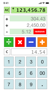
My first go at a design involved creating an "operation list view" which would let me review the operations, and delete if necessary. It looked pretty good; however, while I was looking for a place to put the button for switching the views I came to a realization that the evaluation button "=" was not necessary for the way I used a calculator. Furthermore, since most calculators allow repeated presses of the operation buttons (e.g. "+") to perform the evaluation of the operation, thus making "=" redundant. Therefore, I removed that button and reclaimed some screen space in order to put a second value display, so that I would always be able to see the current calculated value.
At this point, you might be wondering, what did the interface end up like. Here is the latest version.

As I stated in the beginning, a good UI should require a whole lot of explanation so I'm not going to do a walk through here. There is a lot going on here; however, I would suggest reviewing the use case to see if it helps make more sense. Needless to say, it made me happy when I was finished and I rushed off to show people. That experience led to here. The first person I showed could not get over the input box below the operator buttons. I spent about twenty minutes trying to explain what that input was for, and I'm not sure that they really got it in the end.
Every time I end up in a conversation with a person about one of my designs, I try to get knowledge for the future. Here's what I got from that conversation, which I hope will prove useful:
- You and the person you are communicating with have to agree on a common use case. The person kept explaining their confusion based on a different use from my intent.
- A picture is worth a thousand words, but an operating mockup is worth a million. If they had been able to push buttons and see what happened it might have made more sense.
- Some people just enjoy the act of debate. There is no fun in conceding the point, better to focus on creating excitement. The person is currently waiting for the operating mockup so they can tell me what they think about it.
And there you go. I think everyone should try to design a calculator.
Comments
Post a Comment